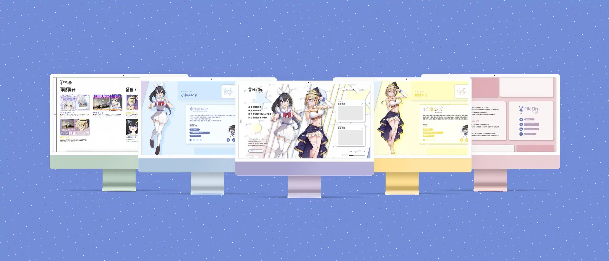
In this website design, It is important to try to make it less informational and make it attractive to keep going and reading on.
The color tone is basic on the new Mic On branding and the 2+1 talents' main color, but the original color is way too strong and bold, the new color set has been offset to lighten and more "pale" tone.
